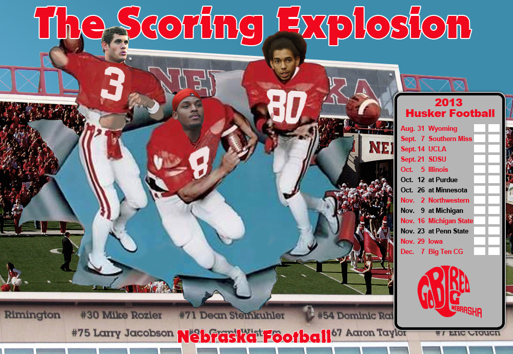
2013 Scoring Explosion
Leave a reply


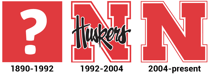
SportsLogos.Net is probably the best site to find information on any major sports team’s logo history. But the Nebraska page is surprisingly bare. They list one primary logo with the timeline stating “0-Pres”. The zero indicates the start date is unknown. For most big schools, you will find logos dating back to the seventies or sixties. But for Nebraska, that’s it. Just one logo.
For some reason they don’t include the Huskers script N logo in the primary logos section, but it’s pretty clear the University used that as their main athletic logo prior to the current logo being introduced around 2004.
Looking through this fun book, I couldn’t find any indication that Nebraska used an official logo prior to the script logo popping up in the early nineties. Interestingly, team logos rarely appeared on ticket stubs or game programs prior to then. But since then, of course, the importance of creating a clear brand has come to be considered very important. You’ll find very detailed guides explaining exactly what the official logos are and how to use them (like this one).
Personally, I like the look of the script logo better than the current one. Maybe the black script is too nineties, but even without it, the thicker red outline and the more narrow N look better to me.
Anyway, if you have any info regarding pre-’92 logos, please comment.